All JoomlaShine templates come with a responsive design to make sure that your website will look beautiful not only on all major web browsers but also on mobile devices.
We also offer a mobile version of the main menu to enhance the mobile user experience. There are 4 types of mobile menu to choose simply by a few clicks via administrator:
Sticky Mobile Menu
Sticky mobile menu allows your users landing on your site using a mobile device easily access to your menu from anywhere on the website, without having to scroll back to the top of the page. By default, sticky menu is automatically enabled for both mobile and desktop devices in Menu & Site Tools section.

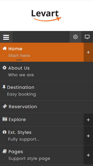
Default Mobile Menu
This is the default mobile menu style showing the menu in full-width form under the toolbar.